Brand
이메일 무단수집거부
본 웹사이트에 게시된 이메일 주소가 전자우편 수집 프로그램이나 그 밖의 기술적 장치를 이용하여 무단으로 수집되는 것을 거부하며,
이를 위반시 정보통신망법에 의해 형사 처벌됨을 유념하시기 바랍니다.
게시일 2021.03.11
Renewal of Samyang Group CI replacement

Renewal of Samyang Group CI replacement.
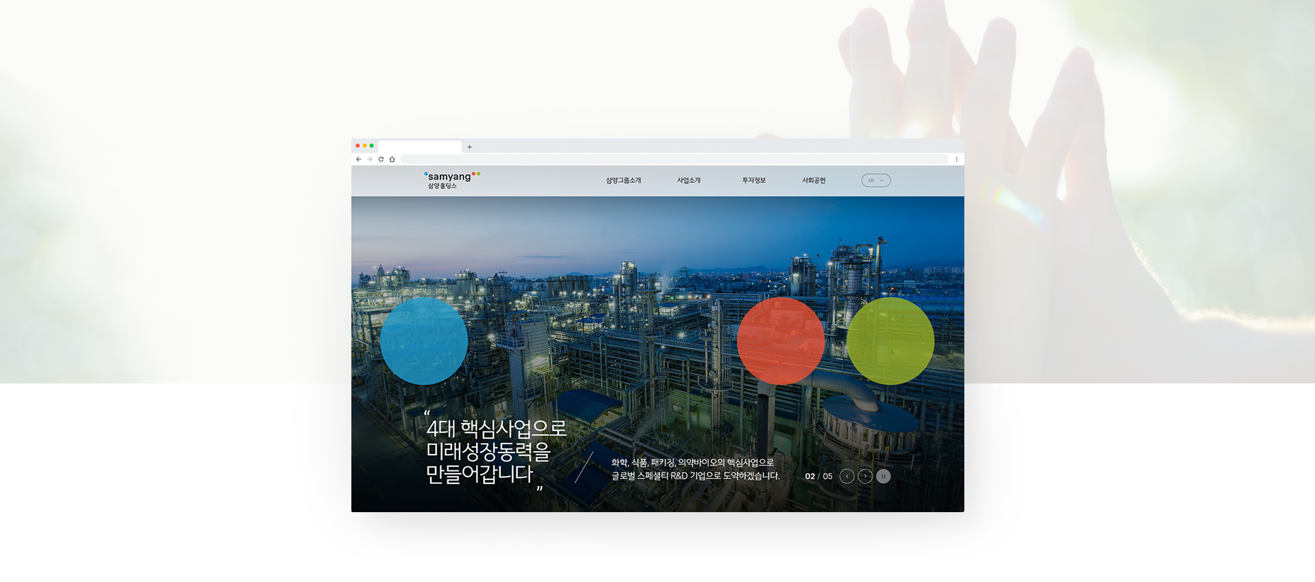
On the occasion of its 92nd anniversary, Samyang Group unveiled a new CI that reinterprets Life’s Ingredients in an easy and friendly way. The new CI is determined to practice open management that actively communicates with customers and employees through various material technologies, and the three primary colors of light used in the logo express Samyang’s vision of “making life rich and convenient” in color.
As a result, the CI of 21 Samyang Group affiliates, including Samyang Holdings and Samyang, has been completely replaced. (including global sites such as Samsung and Jungmun)
· UI / UX Design
· Motion & Web Publishing
· Mobile Web
· Responsive Web


